
Sea-Tac Airport / Port of Seattle
Mobile App Research Study
.png)
Overview
Our UX team worked on conducting research and redesigning the Sea-Tac Airport mobile app. The app was created by the Port of Seattle for Seattle-Tacoma International Airport ("Sea-Tac Airport") patrons. The current app allows users to check wait times for security checkpoint lines, helps travelers navigate the airport with a map, and also tracks flight departure information. Travelers are also able to keep track of where they parked their vehicle in the parking lot and provide information about WiFi and general airport information. Our goal was to improve the experience of travelers who fly through the Sea-Tac Airport with the assistance of the mobile app.
Goal
Improve the current Sea-Tac Airport mobile app's design
Client
Port of Seattle
Responsibilities
UX Research, Data Synthesis,
Persona Creation, User Testing
Customer Research

Interviewing a Sea-Tac Airport app user (left)
To ensure that our Information Architect and UX Designer would be creating flows and screens that make sense to our users, I sought out to find current and previous users of the app. By finding current and previous users, I would be able to collect data as to why/how people are currently using the app, or why people were no longer using the app. In order to find our target users, I first created a survey via Google Forms to learn more about those who fly, particularly those who fly through the Sea-Tac Airport. The survey helped to find quantitative data and determine people’s demographic information (age, where they live), how often they flew, and if they flew through the Sea-Tac airport. From this survey, I was able to filter out people who had used the app before.
Out of the 31 respondents, four participants indicated that they had at least used the app at least once and volunteered to participate in follow-up interviews. I had the opportunity to ask them about their experience when traveling through the Sea-Tac Airport, when the Sea-Tac Airport app would come into play during their experience, what their thoughts were about the app, and what they’d like to see in the app.
I continued to follow up with qualitative interviews to understand the users’ goals and needs when at the Sea-Tac Airport, their goals and needs regarding the app itself, in what context they would use the app, and any pain points and positive points about the app when they interacted with it. By using this method, it made it easier to understand the emotions they went through when interacting with the app. I interviewed four participants who had used the mobile app at least once, done either in-person or by phone call.
The majority of interviewees mentioned that they either found the app through an online ad or by word of mouth. All of the interviewees mentioned that they wanted to use the app to look at waiting times of security checkpoints and check flight details.
Synthesizing the Data

Affinity Mapping results
To better organize the data I collected, I took quotes and information gathered from the follow-up interviews to group any trends and commonalities between each of the interviewees. Groups included the type of phone they used, how often they flew per year, the specific situations in which they would open and use the app, what they liked about the app, and what they didn’t like about the app. All of the groupings can be shown in the image above.
These groupings helped with creating our persona to ensure that we were focusing the design around one type of user that would represent the majority of real users of the app.
Our Persona

Persona card for our main target user
Autumn Collins is someone who travels on the road for work and by plane to visit family. She is all about efficiency, reliability, and convenience. Due to her line of work, she is constantly communicating with clients, driving to various destinations to meet with clients, and is constantly reliant on her phone for everything. Just as she is expected to be professional and on time, she expects her flying experience to be just as smooth. Using the persona I created, our designer was able to move forward with creating screens for the app.
Competitive Analysis
After creating our persona, I did a competitive analysis of seven other airport apps found on the Apple App store. I looked through each of the apps to explore the features each airport included in their app and to understand the user flows to get through each of the features. I found many commonalities among all of them, but also found some new features and ideas for redesigning the flow of the Sea-Tac Airport app.
Some trends that we wanted to implement into the Sea-Tac Airport app included adding more information about the airport itself (airport wifi, what the security process looked like), ideas around how to minimize text and display information with visuals, and also how to make certain flows smoother for users, such as navigating through the airport. This gave our designer a good idea of how to leverage these elements into the app redesign.
Usability Testing

Testing prototypes with research participants
I wanted to dive deeper into the flow of the current app. I recruited three willing participants to run through a few tasks and asked them about how they felt about going through each task. I also collected their SUS score for comparison with the iterations later on.
Beyond testing the current app, I conducted usability testing for each prototype that our designer had created. Our information architect also assisted in facilitating usability testing with a couple of participants for the second and third rounds of testing. Based on the main pain points of the current app, I wrote out three tasks that each participant would have to go through. For each task, they were also instructed to think out loud and vocalize their expectations, likes, and dislikes about the screens they encountered and their overall journey to complete each task.
After each participant finished testing, I had participants complete a System Usability Scale (SUS) survey to collect SUS scores. By collecting and calculating SUS scores, I was able to measure how well each design scored in terms of its usability.
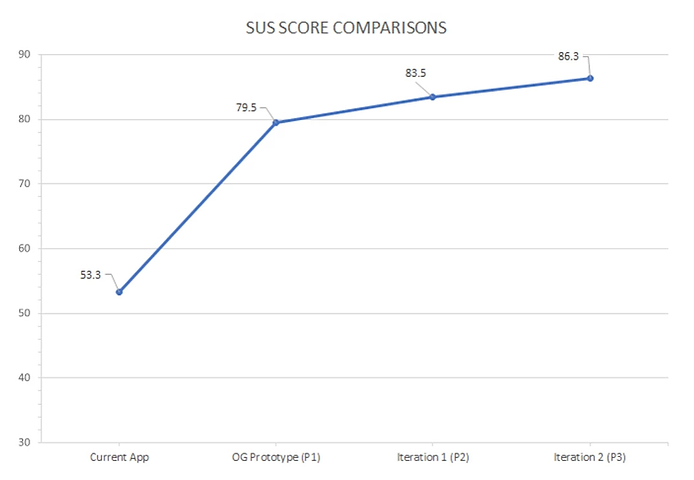
SUS Test Results
.png)
Graph comparing SUS scores for each iteration
To ensure that the iterations were actually meeting our users’ expectations and improving the flow to complete each task, I collected and calculated the SUS scores from every participant during each testing round with the current app and after each iteration of our prototypes. SUS scores, or System Usability Scale scores, are scores that determine how usable people believe a product is. Taking those scores, I averaged the SUS scores for each round and compared them.
The scores for each round were as follows:
-
Current App: 53.3 ("Okay")
-
Prototype 1: 79.5 ("Good")
-
Prototype 2: 83.5 ("Great")
-
Prototype 3: 86.3 ("Great")
Overall, there was a positive increase in the scores, ending with a score that can be labeled as a "great usability score". Based on these scores, our team was able to conclude that the designs improved after every iteration. People also mentioned that they'd be more likely to use the improved app design compared to the Sea-Tac Airport's current version of the app.
Our Final Mockups


Hi-fidelity mockups of the mobile app redesign
Next Steps
For the next steps, I would like to continue testing the most recent prototype with more users, particularly with people who use/have used the Sea-Tac Airport app before. With more time and resources, it would be great to continue designing and testing beyond the main pain points to improve more of the features and flows of the app. Eventually, I would like the team to move forward with creating a clickable prototype to test with users and work with the app developers to determine whether or not our design would be realistic to include or update into the existing app.
Lessons Learned
One of the biggest lessons I learned was how to work as a researcher on a team. I had conducted research before, but it was crucial to stick to the deadlines our Project Manager had set out to ensure that our designer could start wireframing and prototyping in a timely manner. I also gained great feedback regarding how to create a proper persona that our designer could reference. I received good feedback and comments about the importance of grid-lining, as well as writing out the persona to be more personable and less about Autumn’s interaction with the app itself. The feedback and lessons I learned from this project have helped instill more confidence in me as a UX researcher.