
Oasis Tea Zone
Online Food Order System

Overview
Oasis Tea Zone is a local shop that sells bubble tea (a specialized tea drink, usually with tapioca pearls). They also sell food such as popcorn chicken and store merchandise. Upon speaking with a few of their employees, they explained that they’d love to update their website to look more modern and to include the e-commerce function of ordering drinks online on their website.
Goal
Update and add e-commerce function to allow customers to order online
Client
Oasis Tea Zone
Responsibilities
UX Research, UX Design,
UI Design, Prototyping
Research
Client Research
I interviewed two employees at Oasis Tea Zone, including the shop's manager. When speaking with them, I had asked about their website and any expectations to understand what they’d like to see on the website versus what was currently on it. Both of them had mentioned that they’d like to promote their new items. There are many new items and combinations that they’d like to promote, but they feel that the website could help with promoting them. They also mentioned they wanted to incorporate more of their social media (primarily Instagram) so that customers could see what others are also ordering at Oasis Tea Zone. They would also like to see more pictures of the products themselves, as there is currently a menu but no pictures to show customers what each menu item looks like.
According to the manager, an ordering system had previously been on the website, where customers could order online through GrubHub, however, the increase of online orders made it very overwhelming for the already limited staff at their location.

Inside of an Oasis Tea Zone location
Customer Research
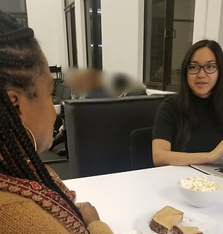
Interviewing an Oasis Tea Zone customer
I also interviewed five Oasis Tea Zone customers about their experience at Oasis Tea Zone, what the ordering process was like for them, asking them about any positives or pain points, and also about their general experience and expectations when ordering food and drinks online. One of the biggest pain points was that customers who wanted to order on the weekend in-store and in the evening were always expected to wait. The Chinatown location is known to be very popular among young adults, primarily college students, who were part of a group of 2-3 people on average in the evenings. Most customers also wanted to know what drinks that others were ordering, as they didn’t always order the same drinks every time, nor did the vast variety of choices make it easy to choose a drink.
Competitive Analysis
To design and implement an ordering feature for Oasis Tea Zone, I continued conducting research by reviewing other websites that had a similar feature on their website. I first started by focusing on shops that primarily customizable drinks for pickup. Based on users’ general experience ordering drinks online, I reviewed the websites for Starbucks, Jamba Juice, Emerald City Smoothie, and Tropical Smoothie Cafe. I ran through each of their websites to understand and document any comparisons and similarities regarding their ordering process, flow, features, page vs. overlay formats, copy, and overall layout designs.
I visited other bubble tea shop websites for design inspiration (ex. Happy Lemon, T-Pumps, Black Ball, Boba Guys, Over the Rainbow Tea Bar, ShareTea), however, a majority of them did not have their own ordering system at the time of this project. For the shops that did, they only allowed customers to order through a third-party such as UberEats or DoorDash. That being said, I only ran the competitive analysis with websites that did not use such third-parties to order food.
Comparative Analysis
I also reviewed other websites that included at least an online ordering process, regardless of the market they were in. This included food stops and clothing shops such as Cafe Rio, Dominos Pizza, Wing Stop, Boxed Lunch, and Barnes & Noble. The main features I focused on included the structure of the menu, the item customization page, as well as the flow of the checkout process. This gave me a better idea of how to set up the overall ordering system.
Card Sorting


Research participants during card sorting
I took the current navigation links on Oasis Tea Zone website and also the interviewees’ expectations of ordering online and created cards. With these cards, I asked five participants to go through an open card sort and group each of the cards into categories that made sense to them. This gave me a better understanding of how to group certain links and screens to continue sketching wireframes.
The Target Persona
To understand our target users, I was given a list of three pre-existing personas with various goals, needs, and expectations regarding their experience with e-commerce. Out of the personas, I focused on designing for John Goodson. Like many of the customers I interviewed, John wanted a simple process and little to no hassle around the navigation of a website. John also wanted to spend time with his daughter, which made Oasis Tea Zone a great candidate to create a pick-up order and allow him to spend time with his daughter at the shop.

John Goodson, the persona
Sketching & Wireframing


My low fidelity wireframes
Taking the information from the user research, competitive/comparative analyses, and card sorting, I leveraged many design points to sketch out some screens. This included the homepage with a section to showcase promotional items and Oasis Tea Zone’s most used social media platform Instagram, as well as rearranging and adding new navigational links for the menu, locations, and “Order Online” feature. I continued sketching the “Menu” page, the overlay for customizing a drink/ food item, the checkout process, and the final confirmation message.
Usability Testing
To determine if my designs made sense, I completed three rounds of usability testing. I asked users about their expectations when landing on a page or overlay, and then also asked them to perform a few tasks while going through the ordering process.
The feedback I received from participants gave me great insight into my designs and helped me iterate for each screen to create four versions of my prototype.
TASKS:
-
Look for drink recommendations
-
Order a Large Iced Taro Milk Tea with tapioca pearls, 50% ice, and 50% sugar
-
Add another Iced Taro Milk Tea with the same specs as in step 2
-
Add an order of Nori Fries with Wasabi Aioli to the cart
-
Complete the order and checkout for a 4:00 pm pickup at the Chinatown location
Design Versions
"Order Now" Screen

"Order Now" screen - version 1 vs. version 2
While testing version 1 of the "Order Now" screen, many people had positive responses about seeing the cart right away while looking through the menu. However, many were also confused about the cart being "stuck" at the very edge of the screen, making them think that they'd have to make the screen bigger for it to fit. I originally designed the cart on the side to be "sticky" and follow the scrollbar. But after learning how this concept had confused people, I updated the design to add some margin in between the cart element and updated the copy of the checkout button.
Item Customization Overlay

Item Customization Overlay - version 1 vs. version 2
When testers were customizing a drink to add to the cart for version 1, at least half of the users provided feedback around the location of the price and the small description of the item they were ordering. Users were expecting the price of the item to be underneath the item header. They also felt that the description of the item was too condensed underneath the header. Taking advantage of the real estate within the overlay, I updated the location of the price and utilized the space to stretch out the copy/text of the description in the next version of the design.
"Checkout" Screen

"Checkout" Screen - version 1 vs. versions 2 & 3
Regarding the checkout process, many testers commented on how each step of the process made sense - from selecting the pickup location, to entering payment information, to the final confirmation message. However, testers were also expecting the calendar icon to be clickable to choose the date. Similar to competitors, I had added a map for people to view different Oasis Tea Zone locations. Most users found this function unnecessary, so I removed the map function for version 2. I also included the cart overlay from the "Order Now" screen so that customers could see their final order.
During testing for version 2, users were happy to see the cart during the checkout process for a quick glance at their cart summary. These users also commented on the grid of the cart, as well as the lack of a back button to go back to the ordering screen. I also added the word 'pickup' for the header "Select Time & Location" for an easy indication to users that 'pickup' is the only option when ordering.
Version 3 Results
During testing of version 3, many of the comments I received were along the lines of the overall process being pretty simple and smooth, with a few questions around why the screens when clicking on the menu and the “Order Now” button were the same. One participant had commented about making the drink/food item customization overlay more compact. With these comments in mind, I moved forward to create a high-fidelity clickable prototype and a design system for the overall website.
Design System

Oasis Tea Zone Style Guide
When creating Oasis Tea Zone's design system, I wanted to make sure that I incorporated the shop's existing brand colors into the website's color palette. While the original website had a darker background, I decided to update the website to a white background instead, allowing the brand colors to take center stage when navigating through the website. Mimicking the energetic, youthful aesthetic that targeted young adults to the shop, I also chose rounded typography and iconography to keep the aesthetics of the brand consistent.
The Prototype
Clickable Version 4 Prototype via Figma
Many testers gave positive feedback around this "final" prototype, stating that it felt like a real website they could order from. Unfortunately, due to the lack of resources, my client wasn't able to incorporate this design into their website.
Next Steps
One of the next steps to tackle would be to continue testing with users who are both familiar and unfamiliar with bubble tea. I would also like to add a clickable calendar icon for users to choose a date, as the limited amount of time prevented me from adding this to my prototype. Another piece to update is the checkout process so that users can click on the sectional bars (ie. "Choose Pickup Time & Location"; "Enter Payment Information", etc.) to go to the previous section. I would also add a call-to-action button/link somewhere on the Menu page so that people can easily toggle over to continue ordering.
After iterating and testing out any new designs, I'd like to work with a developer team to update the Oasis Tea Zone website and ensure that my design will be implemented without any issues.
Challenges & Lessons Learned
While researching and designing for this project, I came across a few various challenges. This included a lack of resources (being the only UX designer on the project) and inability to test my designs with Oasis employees for their feedback.
But one thing that surprised me during testing was the impact that other elements not related to tasks had on our testers. The most notable point being that I had an image placeholder for the Oasis Tea Zone logo, with the text “Oasis logo” to signify what it was. The majority of testers during the first round of testing commented on the text being misaligned. Although it wasn't part of the design I was testing for, I ended up changing it to ensure that people weren't distracted.
Another challenge I came across was that my goal wasn’t measurable. Although I was able to hear positive comments about how much smoother the ordering process had become after a few rounds of iterations, I didn’t have the proper metrics to properly measure success. Moving forward, I would like to continue testing and gather System Usability Scores (SUS Scores) to understand how usable the iterations are.
The biggest challenge in trying to implement the project was the start of the COVID epidemic. During the initial outbreak, many food businesses could no longer cater to people in-person. Although this design of the ordering system might have helped with online deliveries, Oasis employees emphasized the struggles with keeping up with demand, hence focusing on a pickup-only process rather than deliveries. Due to this, the design ended up not being utilized. Despite the COVID outbreak and the overall shift in the food industry, I felt satisfied knowing that people saw this new design as something easy to use.